CSS Experiments @ Bookmark
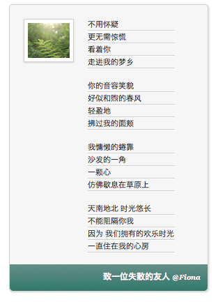
It is sort of a “Hello World” program. But why a bookmark? It’s simply because all the materials I have at hand, a photo shot last autumn in Beijing and a poem for one of my best friends whom I have lost contact with, are appropriate to make a bookmark.

CSS Layout via Float
As you can see, the photo is positioned on the top-left of the page. To do that, I wrap the image in a div and layout the div using “float: left”.
<div class="image">
    <img src="img/tree.jpg" alt="A flowering tree"/>
</div>
.image {
    background: white;
    border: 1px solid #D1D1D1;
    float: left;
    padding: 5px;
    margin: 20px 10px 0 20px;
    -moz-box-shadow: 0px 1px 2px #D1D1D1;
    -webkit-box-shadow: 0px 1px 2px #D1D1D1;
    box-shadow: 0px 1px 2px #D1D1D1;
}
To understand float, let’s think about magazines. In a magazine layout, pictures are usually set into a page such that text wraps around them. This is commonly called “text wrap”. With the CSS float property, text wrap could be applied to web layout too. Floated element remains a part of the flow of the web page; however, it is taken from the normal flow and placed along the left or right side of its container.
There are many issues related to float. One of them is how floated element can affect its parent. If a parent element contains nothing but float elements, the height of it collapses to nothing.
<aside>
    <p>It collapses parent container.</p>
</aside>
aside {
    border: 2px solid teal;
}

p {
    float: left;
}

To solve this bizarre issue, just set parent’s “overflow:auto”. CSS overflow property specifies whether to clip content, render scroll bars or display overflow content of a element.
aside {
    border: 2px solid teal;
    overflow: auto;
}

Another issue is how to clear the float. An element that has the clear property set to it doesn’t wrap around floated elements, but moves down below them.
Line Separator
To make the poem looks like written on a piece of letter paper, I have added some lines between paragraphs. The lines look like cut down on the page. How to get this effect? Well, the adjacency of border-bottom (darker) with border-top (lighter) makes this stair-step effect.
p {
    line-height: 1.5em;
    margin: 0;
    border-bottom: 1px solid #D1D1D1;
    border-top: 1px solid #FFF;
}
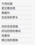
However, we notice that there are some unwanted borders, such as the white border on the very top and the border below the empty line.

To remove these unwanted borders, I resort to the pseudo selector nth-child. I remove the top border on the first line, sixth line, eleventh line…; likewise I remove the bottom border on the fifth line, tenth line, fifteenth line…
p:nth-child(5n+1) {
    border-top: none;
}

p:nth-child(5n+5) {
    border-bottom: none;
}
Shadows
Casting some drop shadows off the boxes make them look 3D.
.image {
    background: white;
    border: 1px solid #D1D1D1;
    float: left;
    padding: 5px;
    margin: 20px 10px 0 10px;
    -moz-box-shadow: 0px 1px 2px #D1D1D1;
    -webkit-box-shadow: 0px 1px 2px #D1D1D1;
    box-shadow: 0px 1px 2px #D1D1D1;
}
0px means the horizontal offset is zero. If this number is positive, the shadow is to the right of the box, while a negative number is to the left of the box. 1px is the vertical offset, which means the shadow is at the bottom of the box. 2px is the blur radius. The higher this number, the more blurred the shadow is. #D1D1D1 is the color of the shadow.
In a similar way, we are able to drop the text shadow.
.footer p {
    font: bold 12px sans-serif;
    text-shadow: 1px 1px 1px #666;
    color: #FFF;
    line-height: 3em;
    text-align: right;
    border: none;
}
Gradient Background
Gradient background is still an experimental feature. Therefore, we have to add prefixes to accommodate various browsers. Here I add a top-to-bottom linear gradient to the footer, beginning at color #658F88 and ending at color #31796C.
.footer {
    padding: 0 10px;
    background-image: -moz-linear-gradient(top, #658F88, #31796C);
    background-image: -webkit-linear-gradient(top, #658F88, #31796C);
    background-image: -ms-linear-gradient(top, #658F88, #31796C);
    background-image: -o-linear-gradient(top, #658F88, #31796C);
    border-radius: 0 0 .5em .5em;
}