Why does Angular break flexbox layout
Why flexbox?
Would you agree or not, flexbox is a new starting point of CSS. Here are some of my personal opinions around it.
Due to the rapid development of web applications, the old normal flow of CSS couldn’t satisfy the modern web app layout. In a normal flow, contents flow down from left to the right, top to the bottom, just like how people read a paragraph. The contents are not vertically contained within the visible boundary. When the contents flow beyond the viewport, a vertical scrollbar appears. In HTML, the viewport means the user’s visible area of a web page, which is the window screen itself.
However, web applications are more like their native counterpart than websites. An app organize contents in pages. A page fills the visible area of the window. All of the elements layout within the viewport boundary either horizontally or vertically. Hence manipulating the vertial positions of the elements becomes especially important in a web app. However, vertically positioning happens to be a pain point of CSS. That’s why Flexbox and Grid layout come to life.
I will give you two examples which used to be so hard in CSS, but become super easy with flexbox.
1. Vertically center elements
Within the flexbox container, all of the child elements are vertically aligned.
.flexbox-container-vertical-center {
    display: flex;
    align-items: center;
}
2. Fill the remaining space of the window
It fills the remaining space of the window and responds properly to windows resize.
.flexbox-fill-space {
    display: flex;
    flex: 1 1 auto;
}
How does Angular break flexbox layout?
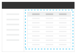
Firstly, let’s take a look at a basic page layout. This graph is taken from Clarity Documentation.

It includes a header bar, a left menu and the right content area. Usually, the header bar and left menu are generic across pages. However, the right content panel is different from page to page. It’s intuitive you would want to implement the right content into different Angular Components.
Suppose the whole page, including the header bar, left menu and right panel are wrapped in the .main-container.
.main-container fills the viewport.
.main-container {
    display: flex;
    flex-direction: column;
    height: 100vh;
}
The right content panel is an individual Component.
right-panel.component.html
<div class="content-area">
    ...It is the right panel component
</div>
right-panel.component.css
.content-area {
    display: flex;
    flex-direction: column;
    flex: 1 1 auto;
}
You might assume that, the right content panel would fill the remaining space of the viewport. However, to your surprise, it doesn’t grow to take the remaining space. It looks like a basic block element. ‘flex: 1 1 auto’ doesn’t take effect. What’s going wrong?
The root cause is Angular addes a HTMLElement to represent the Component. If you inspect the DOM tree, you will find each Angular Component is an element in the DOM tree.
Take the above example, suppose the ‘right-panel’ Component is defined with selector name ‘right-panel’. In the DOM tree, it looks like below:
right-panel Component is a HTMLElement in the DOM tree
<right-panel class="ng-star-inserted">
    <div class="content-area">
        ...It is the right panel component
    </div>
</right-panel>
A parent HTMLElement is added to represent the Component itself. By default, HTMLElment is a block element. Due to this block parent, the child flexbox couldn’t grow at all.
<div class="main-container">            <!-- flexbox -->
    ...
    <right-panel>                       <!-- block -->
        <div class="content-area">      <!-- 'flex: 1 1 0' doesn't take effect because its parent is a block -->
        ...
        </div>
    </right-panel>
</div>
If you need a pure flexbox layout, you have to change the display of the Component itself. To do it, use selector: :host
Make Angular Component flexbox
:host {
    display: flex;
    flex-direction: column;
    flex: 1 1 auto;
    min-height: 0;
}
Please pay attention to min-height: 0. The initial setting on flex container is min-height: auto, which means it cannot be smaller than the size of its content. Hence, when the window size is shrinked smaller than the content size, the flexbox extends beyond the window screen.